BRAND / DESIGN / MOTION GRAPHICS / ANIMATION / VISUAL EFFECTS
Royal London
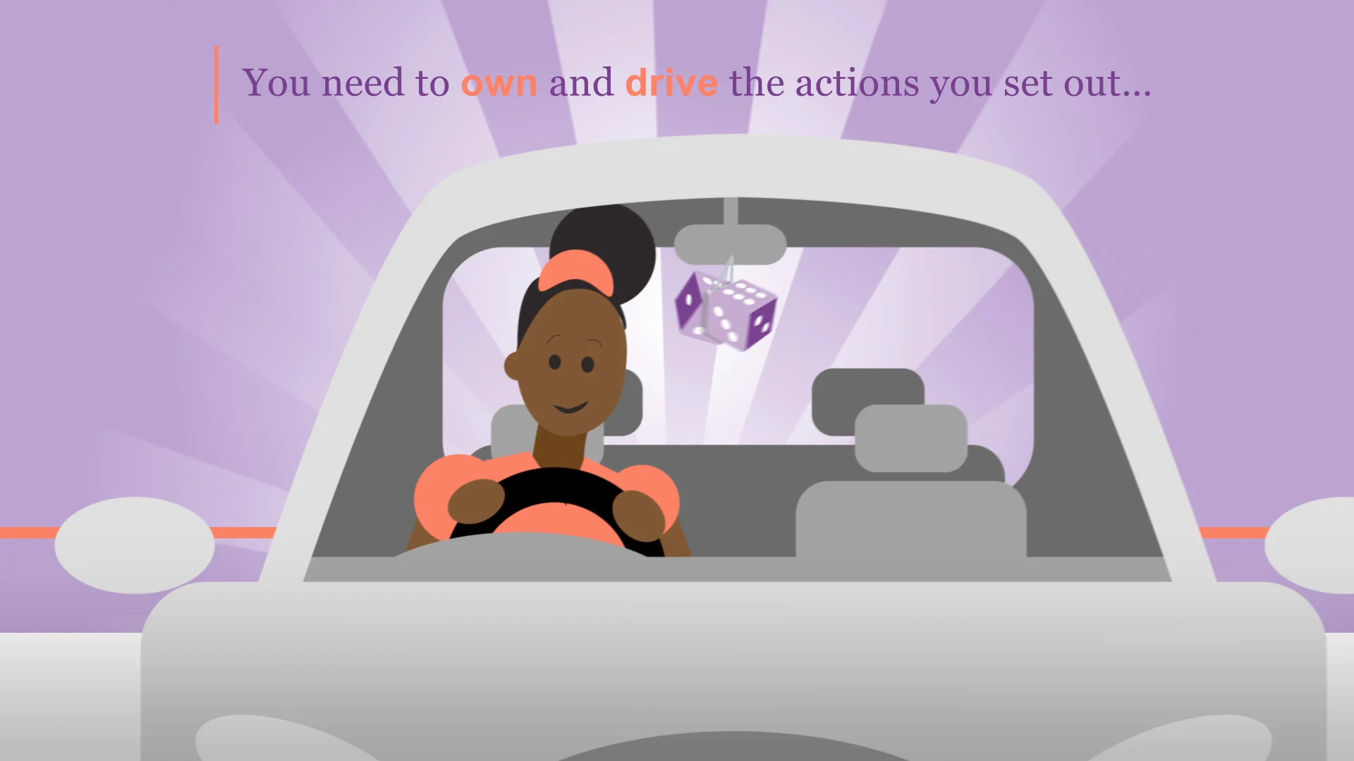
We were approached by Underground Media to help develop, create and animate a short ‘internal comms’ film for Royal London Insurance.
Development Planning is a core value in today’s business World and the brief was to communicate this in a light-hearted and friendly way while still keeping the core message.
TMBC have a strong and enjoyable working relationship with Underground Media and this was another successful venture from initial brain storming and ideas to final render and dub.
We absolutely loved creating and animating this project! The images were strong, but still within the brand guide lines, the animation bright and fun but most important of all the message clear and concise which went down brilliantly with the client.
UK's Strongest Man
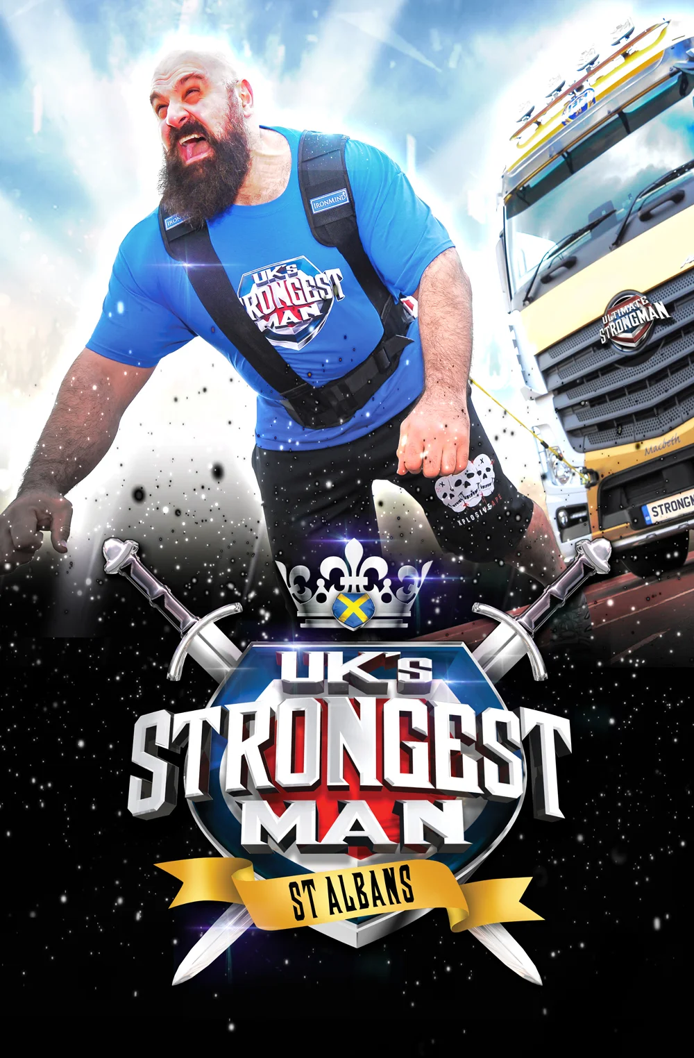
For over 10 years Too Much Black Coffee have designed and redesigned the titles and television look for Channel 5's UK Strongest Man. This year they took the brand to literally the next stage and made it a great event with over 15,000 tickets sold for a three day strongman spectacular, again filmed for Channel 5, in St Albans.
These Strongman are colossal and fantastically strong so we wanted a sequence that showed this. We shot the strongmen in the BBC studios Belfast... we needed the space... the guys are HUGE!! From there we composited them into iconic UK locations, breaking, smashing and crushing things in true giant fashion, ending with a solid, heavy, metallic logo weighing 100 tons!
The new brand/ look has gone down brilliantly with fan, client and broadcaster alike, achieving fantastic ratings!
Bank Super Agent
An integral part of any modern company is customer service and the cherry on this cake is training, product knowledge and understanding. A popular high street bank has an extensive training scheme with the customer at its epicentre.
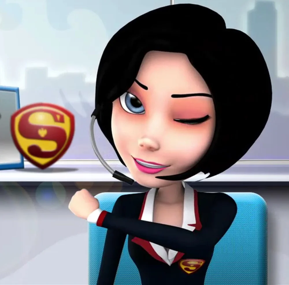
TMBC were approached by Underground Media to help produce an internal film explaining the many ways technology and hard wear that can be utilised to improve modern banking.
This is part one, of a two part character story, with a style that was chosen to keep it friendly and interesting with a light hearted script and bright animation style to keep the viewer interested. This all culminated in a popular little film, on a very modest budget, that went down really well with management and staff alike.
Thurston's Brewery
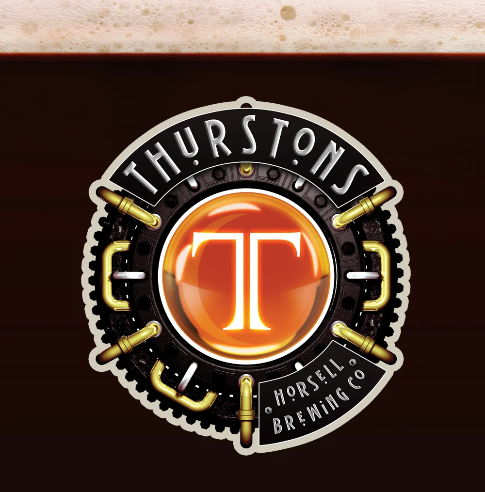
Thurstons Horsell Brewing Co are a new brewery trading in a competitive market looking for a new & exciting look. The brief was to create a company brand that looks contemporary whilst still keeping traditional roots. A 'steam punk' feel was created to look fresh, interesting & unique accross this cross platform brand.
Bank Mortgage Snail
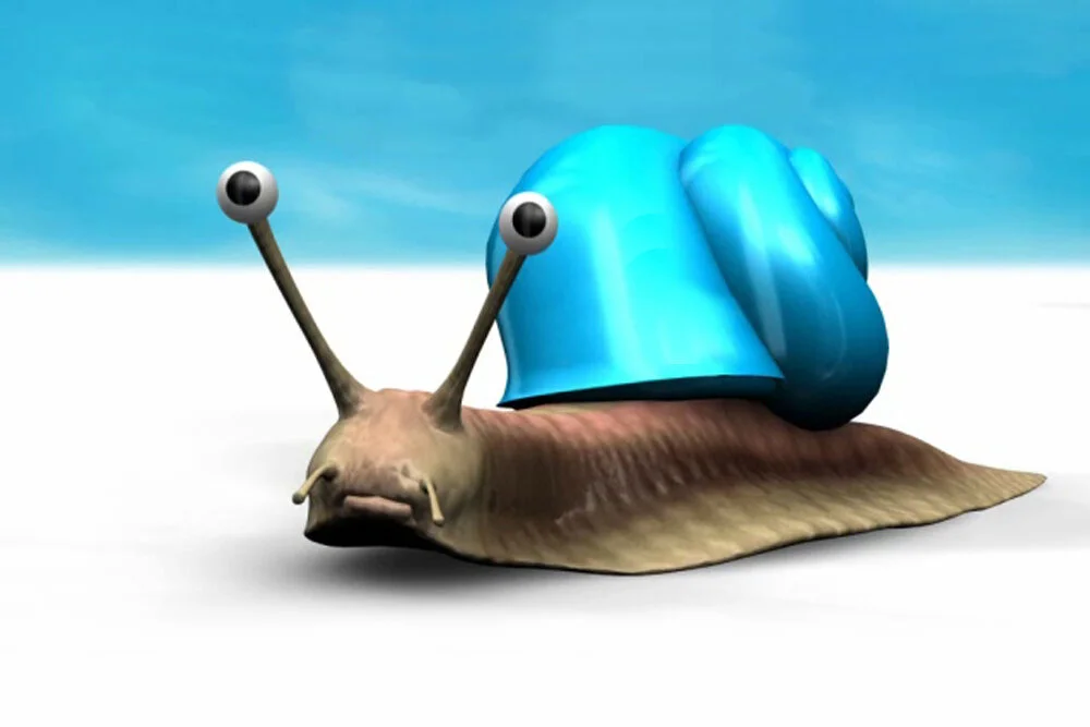
Working in association with Underground Media we were asked to help make some internal films for a popular high street Bank to explain some of their services. For the Mortgage film we decided to use a dour, northern snail character, who always carries his home on his back (obviously), and the tail of his shell upgrade. This was a lovely, fun job which used a light-hearted, uplifting script, a great voice-over and some wonderful animation to achieve a really successful result. Banking doesn't need to be boring!
KOTV Classics
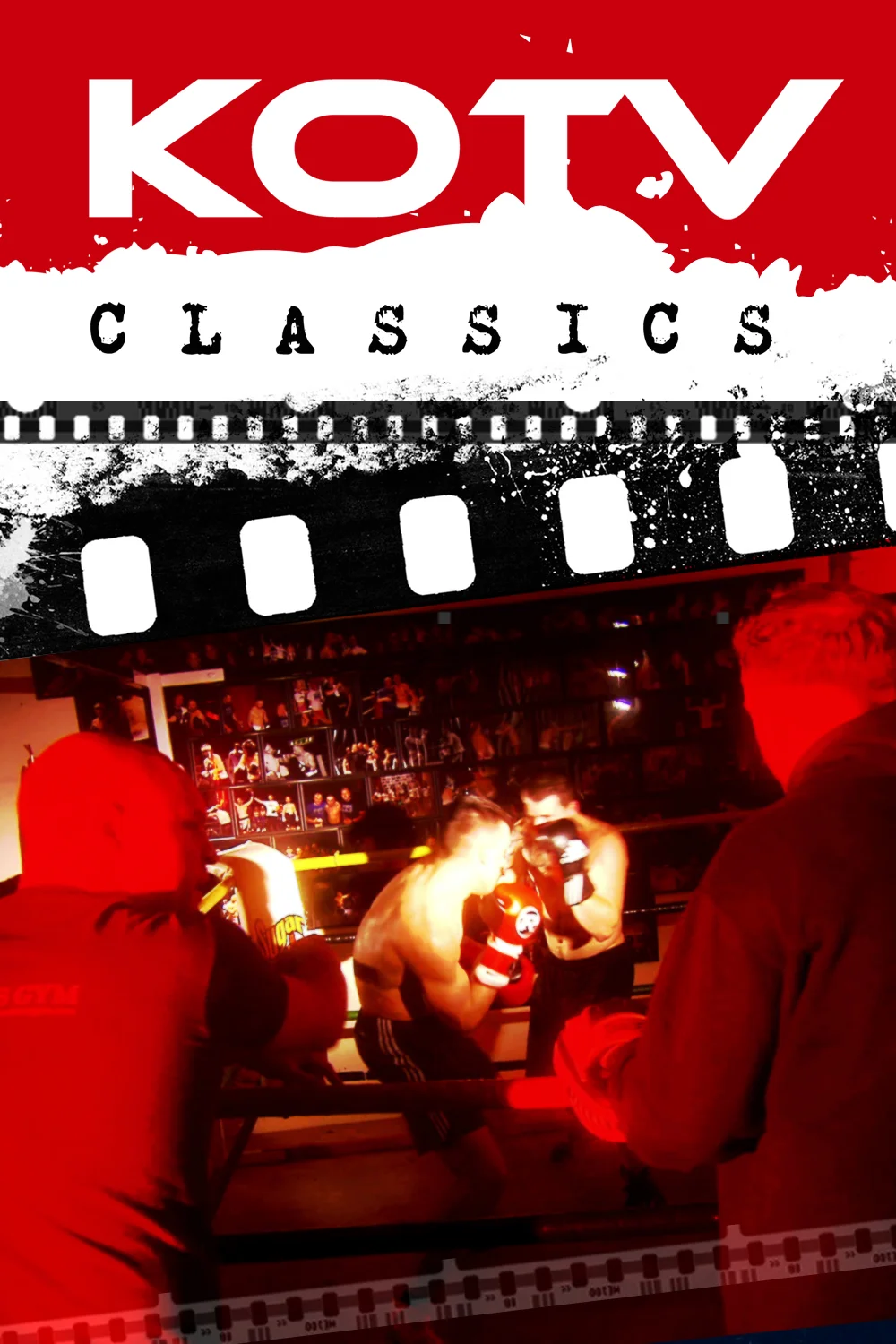
KOTV are a broadcaster producing quality sports content for a global market. The brief was to create an opening sequence for their historic boxing magazine programme that was gritty and real. Shooting in a proper 'old school' boxing club with their current talent of boxers/trainers, rather than models, we retained strong authenticity. We then composited them with graphic posters that were 'alive' with old archive footage resulting in an exciting, slightly dark/moody, fast paced sequence and strong graphic brand.
GOAL!
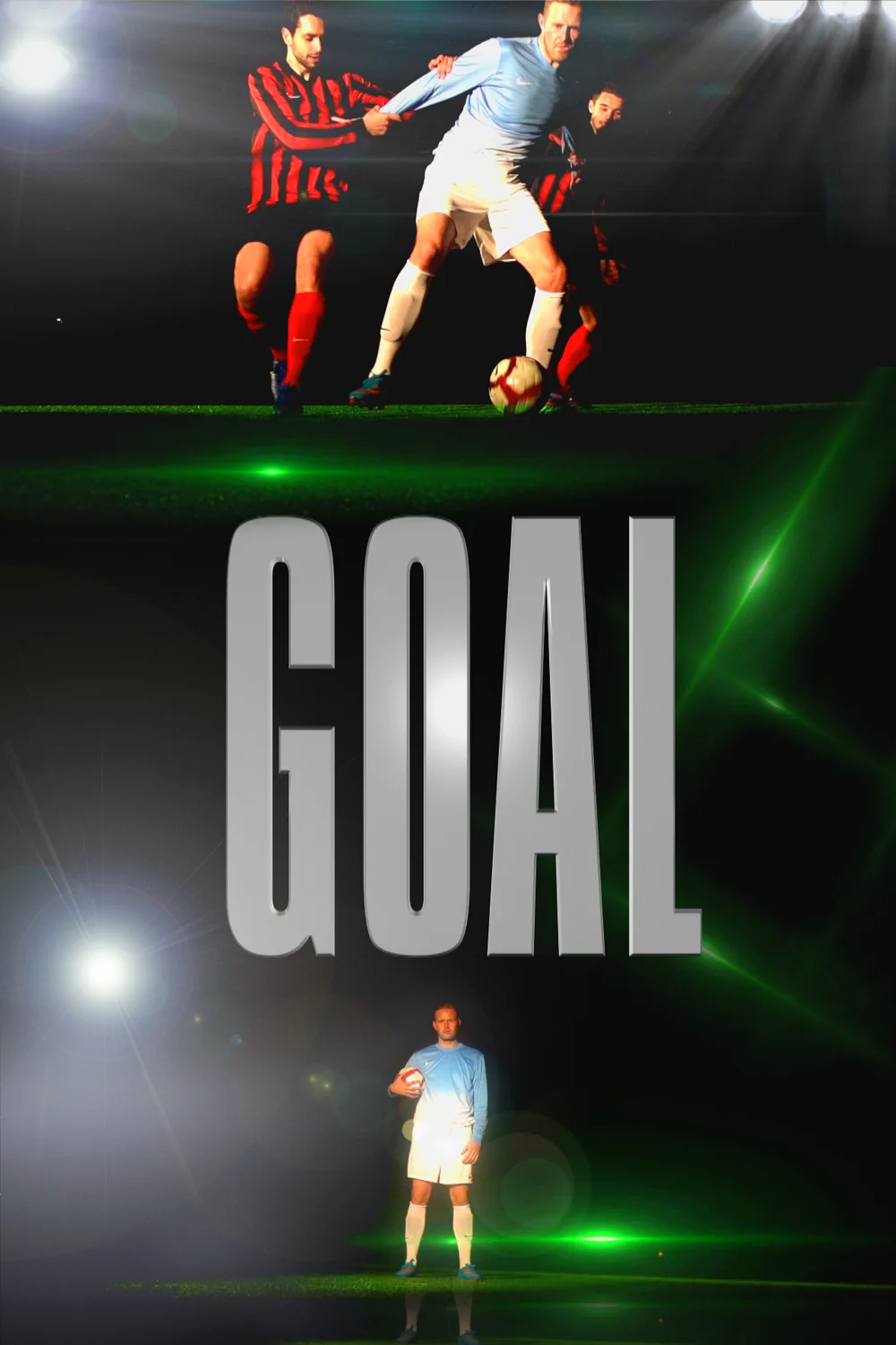
KOTV are a broadcaster producing quality sports content for a global market. Goal! Is a new football show showcasing football leagues from around the World. We wanted to produce a sequence that was slick, pacey, and modern. We shot professional players, against strong graphic backgrounds and composited layers of strong graphics, speed ramping and effects to achieve an exciting, fast paced and contemporary title animation and graphic package. A strong look for a great international programme.
Kingsley Construction
Kingsley Construction are a new building company priding themselves on a solid reputation and quality work. In order to build the brand we managed to take the 'King' in Kingsley as a springboard for ideas. We took that and made a logo that was a shield, a crown and a castle all in one strong brand promoting strong foundations, solid walls and a quality finish.
All we then had to do was find a truck for delivery!
Paultons Park
Paulton’s Park, ‘The UK’s Favourite Family Theme Park’, asked our client Riff Raff Media to, amongst other things, animate their already well known, strong brand and design more graphic content for their prolific media output… we were more than happy to help!
We absolutely loved animating this well known theme park logo and thoroughly enjoyed helping them develop Paultons’ Park TV and social media output.
Eagle Claw Kung Fu
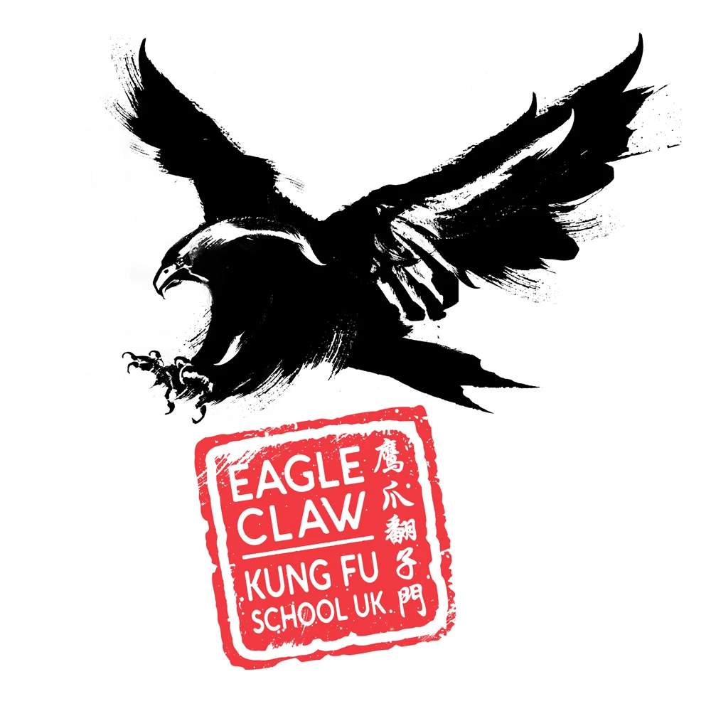
Having spent over 36 years studying mostly traditional Japanese martial arts it was an absolute pleasure to help a friend from the ‘Chinese side’ redevelop his Kung Fu brand.
Eagle Claw Kung Fu is is a style of Chinese martial arts known for its gripping/ ripping techniques, system of joint locks, take downs, and pressure point strikes akin to that of a fighting Eagle.
To honour this, we took an image of a swooping/ attacking eagle and re-illustrated it by hand in a Chinese caligraphic style.
The illustration took forever to make it look authentically Chinese, but hopefully the strong image that resulted, complimented by the ‘chop’ text logo, made it all worth wild!
KOTV Classics
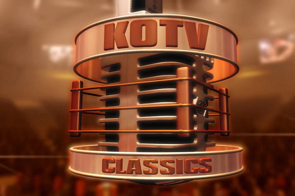
The ‘Original’ KOTV Classics has had a long and heralded life, which still lives on today. This dynamic sequence (and brand), based on an animated ring mic echos over a hundred years of boxing on film. KOTV Classics has, over the years, gone from strength to strength showcasing the best of boxing history and spawned ‘sister’ shows such as KOTV Top 50 Knockouts.
Heliostor
Heliostor are a leading technology services company specialising in data and IT systems. After a lack lustre re-brand we were invited in to bring the company, brand and website, into the 21st Century… what they already do, and have been doing for a very long time, in their technical services.
With a name that includes the word ‘Helio’ it automatically lends itself to a sun-centric/ planet/ ‘atomic’ feel. After a good bit of development we came to this final logo which looks modern, futuristic and reliably techy… love it!
Get A Grip Media
Get A Grip Media are an exciting, fun and engaging new media company looking to show that in their logo, website & company brand… with an off centre approach and a wicked sense of humour they are indeed a bunch of cheeky monkeys.
Aikido
Aikido means ‘The Way of Divine Harmony’ so to realise this we have used the ‘ichi en’.. one caligraphic brush circle with the kanji of Aikido on an ink smear. On top of this we ghosted the founder of Aikido with golden Chrysanthemums, the flower of the Japanese emperor!
Look out for this new T-Shirt design for Aikido coming soon from Temple Bell T-Shirts… a new brand specialising in traditional martial arts apparel.
Absolute Interiors
Absolute Interiors are a construction/renovation company priding themselves on great quality work and design. These qualities come across in the sharp design & 'constructed' industrial look.
Wine Utopia
Wine Utopia Brand. A fruity little number designed with elegance, class and sophistication!
TMBC... you'll have a good time but never a hangover!
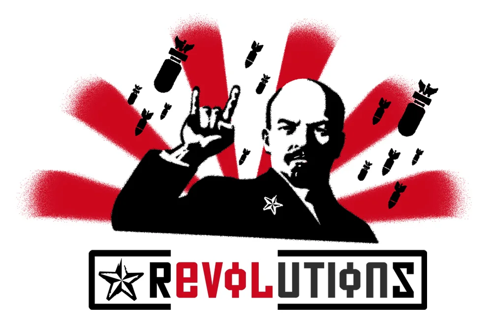
Revolutions
A bit left field but great fun... we've just branded a Heavy Metal Band! ROCK!!!!
With a name like 'Revolutions' we went down a 'Russian revolution' route and took an iconic picture of Lenin and played around with the image so he was throwing out 'horns of rock' amid bombs and chaos... epic!!! For the text we realised that if we used the Russian cyrillic text an 'O' has a line through it... revealing the word 'Evil' and 'Love' (backwards) all adding interest and depth.
Really enjoyed designing this... all we need to do now is make stencils and spray all over town... Graffiti responsibly kids!!
