BRAND / DESIGN / MOTION GRAPHICS / ANIMATION / VISUAL EFFECTS
Eagle Claw Kung Fu
Having spent over 36 years studying mostly traditional Japanese martial arts it was an absolute pleasure to help a friend from the ‘Chinese side’ redevelop his Kung Fu brand.
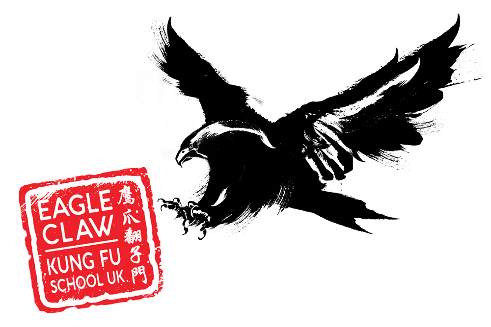
Eagle Claw Kung Fu is is a style of Chinese martial arts known for its gripping/ ripping techniques, system of joint locks, take downs, and pressure point strikes akin to that of a fighting Eagle.
To honour this, we took an image of a swooping/ attacking eagle and re-illustrated it by hand in a Chinese caligraphic style.
The illustration took forever to make it look authentically Chinese, but hopefully the strong image that resulted, complimented by the ‘chop’ text logo, made it all worth wild!
Thurstons Brewery
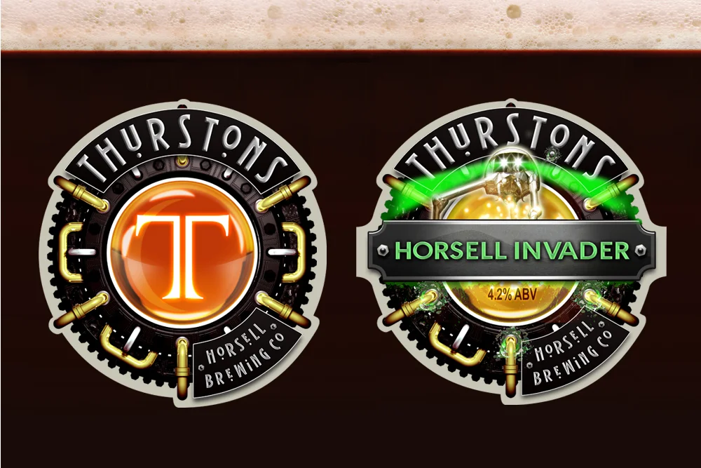
Thurstons Horsell Brewing Co are a new brewery trading in a competitive market looking for a new & exciting look. The brief was to create a company brand that looks contemporary whilst still keeping traditional roots. A 'steam punk' feel was created to look fresh, interesting & unique across this cross platform brand.
The brand has evolved to include over 17 individually designed pump clips and the branding of the CAMRA Woking Beer Festival two years running and we’re on for a third this year!
Kingsley Construction
Delivering the final logo to Kingsley construction on the back of a flat bed truck!
Kingsley Construction are a new building company priding themselves on a solid reputation and quality work. In order to build the brand we managed to take the 'King' in Kingsley as a springboard for ideas. We took that and made a logo that was a shield, a crown and a castle all in one strong brand promoting strong foundations, solid walls and a quality finish.
All we then had to do was find a truck for delivery!
Ultimate Strongman
The last couple of years have been a busy time for Ultimate Strongman and UK’s Strongest Man with many live, televised events throughout the UK.
This was exciting for us as it gave us the chance to put unique spins on the graphic look, and marketing (television, print, banners and social media) while still keeping within the brand style.
We have a great client who welcomes ideas, as well as devises them themselves, and sends us in some very new, creative and dynamic places.
Absolute Interiors
Absolute Interiors are a construction/renovation company priding themselves on great quality work and design. These qualities come across in the sharp design & 'constructed' industrial look.
Revolutions
A bit left field but great fun... we've just branded a Heavy Metal Band! ROCK!!!!
With a name like 'Revolutions' we went down a 'Russian revolution' route and took an iconic picture of Lenin and played around with the image so he was throwing out 'horns of rock' amid bombs and chaos... epic!!! For the text we realised that if we used the Russian cyrillic text an 'O' has a line through it... revealing the word 'Evil' and 'Love' (backwards) all adding interest and depth.
Really enjoyed designing this... all we need to do now is make stencils and spray all over town... Graffiti responsibly kids!!
Signature
Signature is an exclusive men and ladies’ designer-wear. The brief was to create a stylish, high quality brand, full of panache, that would not overshadow that of the clothing manufacturers. The brand then needed to work across the store, signage and the website.
Another very successful job that was again a lot of fun to do and gave us a very useful heads-up into the world of fashion and retail.
Get A Grip Media
Get A Grip Media are an exciting, fun and engaging new media company looking to show that in their logo, website & company brand… with an off key approach and a wicked sense of humour they are indeed a bunch of cheeky monkeys.
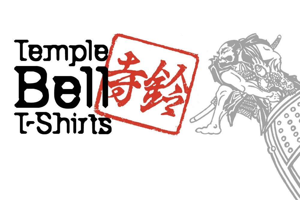
Temple Bell T-Shirts
Look out for this new T-Shirt brand coming soon, Temple Bell T-Shirts, specialising in traditional martial arts apparel to make your club/ association stick out from the rest.
Not only does this logo look great but we have an expanding portfolio of stunning T-shirt designs and brands coming soon!
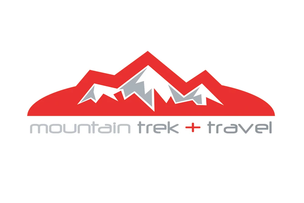
Mountain Trek + Travel
Mountain Trek + Travel are an outdoor shop and brand specialising in everything you would need in the great outdoors whether it is for walking, camping, climbing, expeditions or adventures they have the right quality piece of kit for you!
The outdoor leisure market is a saturated industry with everybody fighting for the same ‘buck’ so it was vital that MTT stood out from the rest. We noticed that no one used red as their signature colour so used this as our springboard.
The end logo, abstracted from three peaks, was an automatic winner which lead us to heavily brand the shop from signage to posters, from t-shirts to store cards.
A great involved client and a sharp, eye catching brand! Just what we like to see!
Kendo World Championships
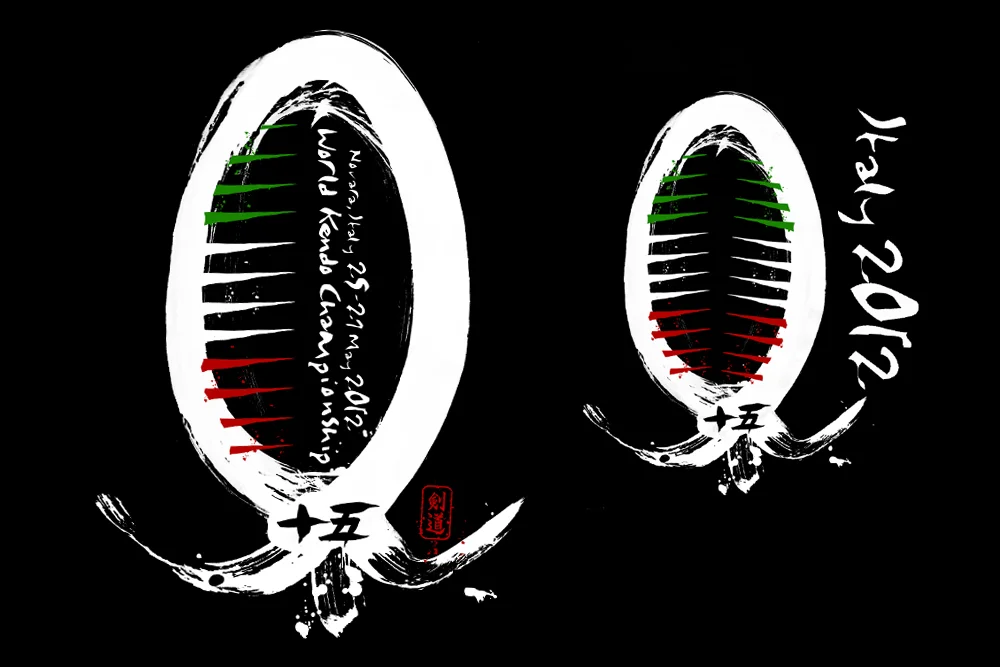
We were approached by Nine Circles, producers and importers of quality Japanese martial arts equipment, to design a T-shirt to celebrate the World Kendo Championships being held in Italy in 2012. With teams coming from every corner of the World it was a unique opportunity to get the event and the client noticed.
Nine Circles were blown away with this design, based on a kendo ‘men’ (helmet) created using Japanese calligraphy brushes with the Italian flag as the grill on the front.
A new challenge and a really creative and enjoyable project to work on.
Aikido
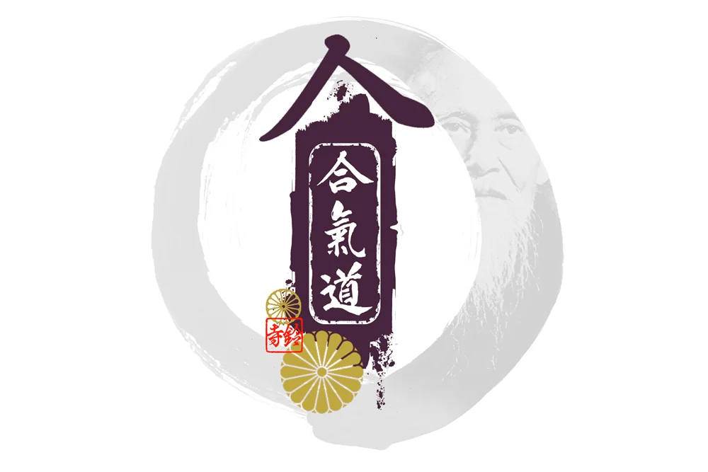
Aikido means ‘The Way of Divine Harmony’ so to realise this we have used the ‘ichi en’.. one caligraphic brush circle with the kanji of Aikido on an ink smear. On top of this we ghosted the founder of Aikido with golden Chrysanthemums, the flower of the Japanese emperor!
Look out for this new T-Shirt design for Aikido coming soon from Temple Bell T-Shirts… a new brand specialising in traditional martial arts apparel.
Twenty Ninety
2090 are a renewable energy company, their core business being photo voltaic (solar panels) management. To brand them we took the idea of using a comet streaming across the heavens to give them a modern, slick, techy look. This project went from branding, print and web to a 3d web video explaining complex systems. A really enjoyable job to work on.
Fight+
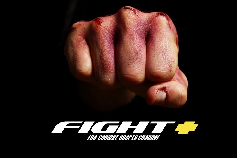
Fight+ ‘The Combat Sports Channel’ a satellite platform for all forms of fighting and martial arts.
Our brief was to produce a strong brand and logo-type that could be used across platforms to encourage brand recognition. The Fight+ fist became an iconic part of the brand… bruised and cut to reflect true combat experience.
For the titles and brand motion graphics we shot some of the finest martial artists in the country form all disciplines on c-key and comped them all together in a maelstrom of martial mayhem!
A good, strong project full of energy and excitement… all good wholesome family fun!
Wine Utopia
Wine Utopia Brand. A fruity little number designed with elegance, class and sophistication!
TMBC... you'll have a good time but never a hangover!
Kurgan K1
A friend and fighter asked us to make a brand for himself based on his fight name - Kurgan. The fight style is called K1 which is full contact kick boxing… it’s tough, bloody and exciting.
The K in Kurgan was a gift. The K1 text slotted beautifully into the logo, with blood splatters and fire to compliment the modern fight look. Then all we needed to do was put a portrait of the fighter in the middle to cement his brand.
Now all we need to do is sell a million T-shirts…
Kurin Swords
'Kurin' is a new brand for Japanese martial arts supplier Nine Circles. We wanted the look to be modern and fresh but reflecting the history and traditions of Japanese kenjutsu (swordsmanship). We created an 'ink swathe sword' icon to mirror Japanese calligraphy but kept it sharp and slick. The text was modern but deliberately kept blocky and simple to mirror Japanese design with an embellishment of the kanji for 'Kurin'. The brand is a great success and the client is very happy indeed... we're just glad they liked it... those things are sharp!!!
Mountain Goat
Mountain Goat is the company of an outdoor instructor, team leader and wild camping guide, named in part by the fact that he is a Capricorn.
A light-hearted look was needed to attract an clientele who want an enjoyable day in the mountains and not shouted at by a drill sergeant.
We came up with a Mountain Goat character, merged it with a rough and ready logo style and then covered it with boot prints and dirt… what else do you want in the Lake District! The client loves it so look out or it when you’re climbing Scafell Pike!
Cookery School
Cookery School Logo... does what it says on the tin but in a new, funky, modern style… it’s definitely more ‘Heston’ than Mrs Beaton with a touch of the Willy Wonkas about it!
Tengu
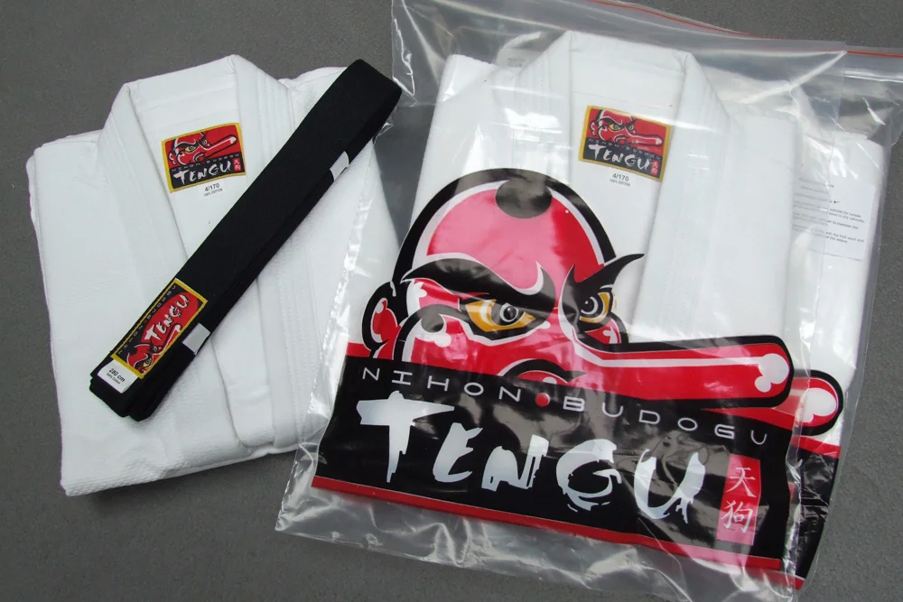
Tengu are Japanese mountain goblins known to possess mastery & secrets of the martial arts. Using this as a trigger we created a strong, proud, unflinching brand harking back to Japanese mythology & design. The brand has since grown from strength to strength resulting in global distribution.
The Crown Horsell
The Crown, Horsell is a proper boozer rather than a trendy gastro-pub. It also happen to be the pub connected to Thurstons Brewery, so when they wanted to update their logo/ look/ pub sign they asked us to come up with something modern but with a traditional slant.
We worked on some traditional but elegant text and combined it with a fluid, floral clown and then added some hops to mirror the beer they supply and the brewery they also own.
Now the logo is signed off look out for the website… we’ve got some great ideas.
Hasu
‘Hasu’ is Japanese for The Lotus flower.
When Nine Circles (suppliers of classical Japanese martial arts equipment) were looking for a name for their range of sword bags they settled on Hasu reflecting the special connotations to the Buddhist and Shinto philosophies and the martial arts.
The lotus is considered symbolic of enlightenment as it starts deep within the mud and in time grown through the mud, up through the water and finally up onto the surface where it produces the most beautiful flower.
The logo is obviously a lotus flower, but built up of many petals to symbolise the multi facets of buddhism. The smaller logo is the kanji for Hasu and it designed to be the ‘pull’ on the sword bag zips.
A very popular brand, eye catching, classy and selling very well!
Accountrix
Accountrix… because accounting doesn’t need to be boring!
A wonderful client and an exciting tilt on a popular theme… there is nothing better than when a client comes to you and they want their vision to match their brand to look and feel different from the norm.
When someone comes to you and says ‘can you please brand our accountancy firm’ you never expect it to be such fun! We initially tried text surrounded with numbers and played with more traditional fonts etc etc but everything really started working when we chose every type face and image we didn’t expect to work… and then it did!
It may not solve World peace but taking something away from its norm and transferring it into something unexpected is truly exciting!
Sophisticated Style
Sophisticated Style are an events company primarily working in the wedding sector. It is a very competitive market and it is important to have a look that stands out from the rest… it is also a market that gives you free reign to cover anything is Swarovski crystals!
We wanted to use a script typeface but also mix it with ‘back to back’ elegant S’s, incorporating a heart, and then once we’d covered it in crystals and light flares we placed it on a beautiful campaign silk background.
‘… with this bling I thee wed…’
Gobbo Fitness
Being a personal gym trainer today is a competitive business. In order to put yourself ahead of the game more and more trainers are making themselves a brand as a platform to market themselves and sell branded products.
This logo was created for a client known as ‘Gobbo’ (don’t ask lol!). She is a powerhouse whose strength could give most guys a run for their money. In view of this we decided to use the head of a lioness denoting female power and strength. We then comped it into a quirky fun logo with a modern typeface and a fresh colour palette.
The Craneley Group
The Cranely Group are an offshoot of one of our other clients, an already very well established, successful building company.
The brief here was to come up with a logo that looked modern, sophisticated and professional while reflecting the high quality build and finish of their ‘new builds’ and ‘high quality conversions’.
Once we had achieved this we then went on to cement the brand with a modern and slick website.
Sam Berrido
Sam Berrido is a very talented cameraman, with a fantastic eye for a shot, who we have worked with, and alongside, for the last 15 years. When he came to us he was looking for something 30’s inspired, using light shards but with a modern twist.
He was blown away with this logo which then became the centre of an advertising and marketing campaign to boost his already strong profile.
If you need a good guy and great cameraman you’ll have to go a long way to find better!
Saxon Fightgear
Saxon Fightgear is a brand grown from proper ‘spit and sawdust’ boxing training… fight training as it should be… Tough, resilient and strong!
The logo is designed to reflect this, with a well used, distressed look. The name Saxon is meant to reflect a history of British combat with a union shield to compliment this, set off with a couple of crossed axes. The secret here was to have a good balance of strength and distress while avoiding any overly right wing imagery, always a potential pitfall when using a Union Flag.
Look out for this brand, coming your way on bags, gloves, clothing and just about anything boxing related… a really great, successful project to work on.
